WEB animation & effect
Water wave animation
SeaPlus
2021. 9. 12. 00:51
[구성요소]
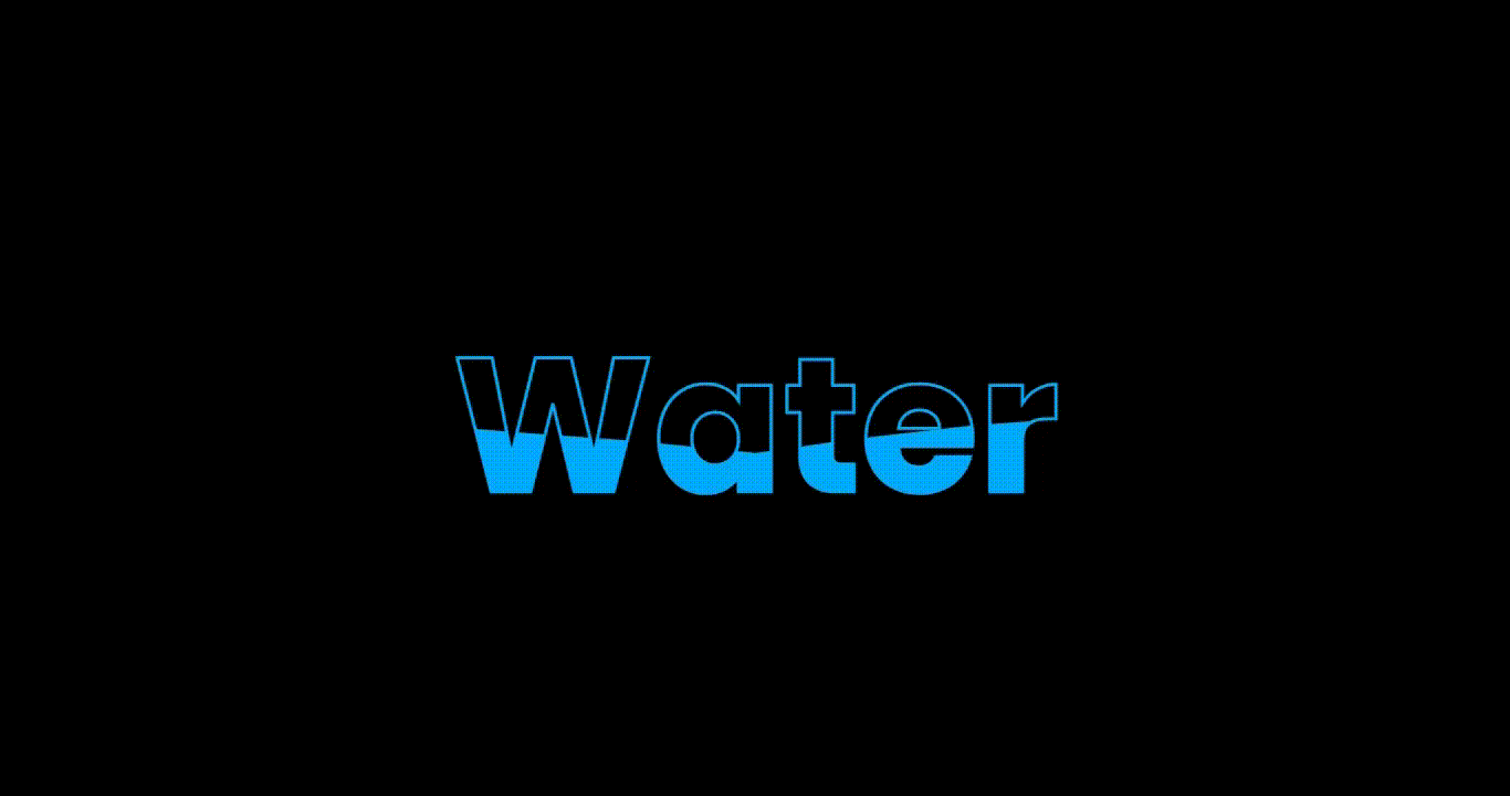
- h2 두개로 구현된 애니메이션
- content h2:nth-child(1) 는 water 문자를 표현하는 역할
- content h2:nth-child(2) 는 water 내부의 물결치는 애니메이션으로 만든다.
[Clippy - CSS clip-path maker]
Clippy 사이트 ( https://bennettfeely.com/clippy/ )
- clipy-path 함수는 shape을 생성하는 함수이고 지정 값을 통해 원하는 모양을 만들 수 있다.
- 사이트를 통해 물결모양을 생성한다.
[HTML]
<!DOCTYPE html>
<html lang="en">
  <head>
    <meta charset="UTF-8" />
    <meta http-equiv="X-UA-Compatible" content="IE=edge" />
    <meta name="viewport" content="width=device-width, initial-scale=1.0" />
    <title>Document</title>
    <link rel="stylesheet" href="./style.css" />
  </head>
  <body>
    <div class="content">
      <h2>Water</h2>
      <h2>Water</h2>
    </div>
  </body>
</html>
[CSS]
@import url("https://fonts.googleapis.com/css2?family=Poppins:wght@100;200;300;400;500;600;700;800;900&display=swap");

* {
  box-sizing: border-box;
  margin: 0;
  padding: 0;
  font-family: "Poppins", sans-serif;
}

body {
  display: flex;
  justify-content: center;
  align-items: center;
  min-height: 100vh;
  background: #000;
}

.content {
  position: relative;
}

.content h2 {
  position: absolute;
  font-size: 8em;
  transform: translate(-50%, -50%);
}

.content h2:nth-child(1) {
  color: transparent;
  -webkit-text-stroke: 2px #03a9f4;
}

.content h2:nth-child(2) {
  color: #03a9f4;
  /* animation: animate 4s ease-in-out infinite; */
  animation-name: wave;
  animation-duration: 4s;
  animation-timing-function: ease-in-out;
  animation-iteration-count: infinite;
}

@keyframes wave {
  0%,
  100% {
    clip-path: polygon(
      0% 44%,
      14% 42%,
      30% 46%,
      47% 55%,
      66% 58%,
      88% 53%,
      100% 46%,
      100% 98%,
      0% 100%
    );
  }
  50% {
    clip-path: polygon(
      0 58%,
      13% 65%,
      30% 66%,
      53% 65%,
      68% 51%,
      83% 47%,
      100% 50%,
      100% 98%,
      0% 100%
    );
  }
}