WEB animation & effect
로딩 애니메이션 : rotate circle
SeaPlus
2021. 9. 29. 21:27
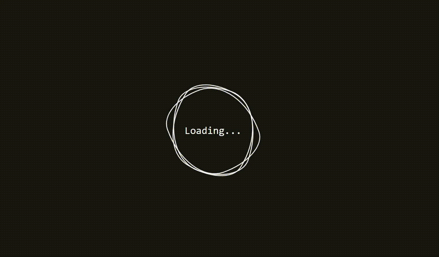
[구현 효과]
360도 회전하는 원형 모양의 요소 3개를 생성한다.
약간 찌그러진 원형의 모양은 Fancy Border Radius Generator 라는 사이트를 이용해 쉽게 구현할 수 있다.
[ https://9elements.github.io/fancy-border-radius/#49.69.55.31--. ]
Fancy Border Radius Generator
Generator to build organic shapes with CSS3 border-radius
9elements.github.io
[HTML]
<!DOCTYPE html>
<html lang="en">
  <head>
    <meta charset="UTF-8" />
    <meta http-equiv="X-UA-Compatible" content="IE=edge" />
    <meta name="viewport" content="width=device-width, initial-scale=1.0" />
    <title>Loding animation</title>
    <link rel="stylesheet" href="./style.css" />
  </head>
  <body>
    <div class="loader">
      <!-- span은 애니메이션 효과가 적용될 요소 -->
      <span></span>
      <span></span>
      <span></span>
      <h2>Loading...</h2>
    </div>
  </body>
</html>
[css]
* {
  box-sizing: border-box;
  margin: 0;
  padding: 0;
}

body {
  display: flex;
  justify-content: center;
  align-items: center;
  background: #111;
  min-height: 100vh;
}

.loader {
  position: relative;
  width: 200px;
  height: 200px;
  display: flex;
  justify-content: center;
  align-items: center;
}

.loader h2 {
  color: #fff;
  font-family: consolas;
  font-weight: 500;
}

.loader span {
  position: absolute;
  top: 0;
  left: 0;
  /* loader의 크기를 다 차지 */
  width: 100%;
  height: 100%;
  border: 2px solid #fff;
  pointer-events: none;
  animation-name: animate;
  animation-duration: 5s;
  animation-timing-function: linear;
  animation-iteration-count: infinite;
}

/* 첫번째 span */
.loader span:nth-child(1) {
  border-radius: 69% 31% 69% 31% / 49% 55% 45% 51%;
}
/* 두번째 span */
.loader span:nth-child(2) {
  animation-direction: reverse;
  border-radius: 69% 31% 69% 31% / 49% 55% 45% 51%;
}
/* 세번째 span */
.loader span:nth-child(3) {
  animation-duration: 3s;
  border-radius: 69% 31% 69% 31% / 49% 55% 45% 51%;
}

/* animate 는 360도 도는 애니메이션 */
@keyframes animate {
  0% {
    transform: rotate(0deg);
  }
  100% {
    transform: rotate(360deg);
  }
}