WEB animation & effect/button
그라데이션 버튼 effect
SeaPlus
2021. 10. 4. 18:14
[HTML]
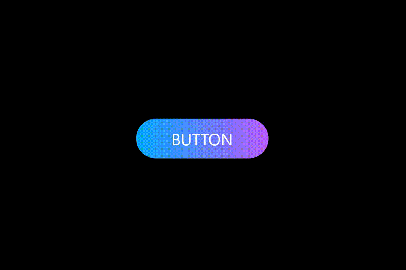
<a href="#">Button</a>
[CSS]
* {
  box-sizing: border-box;
  margin: 0;
  padding: 0;
}
body {
  background-color: #000;
}

a {
  z-index: 1;
  position: absolute;
  top: 50%;
  left: 50%;
  transform: translate(-50%, -50%);
  width: 200px;
  height: 60px;
  background: linear-gradient(90deg, #03a9f4, #f441f4, #ffeb3b, #03a9f4);
  /* 배경사이즈를 x축, y축으로 4배 늘린다. */
  background-size: 400%;
  color: #fff;
  border-radius: 30px;
  text-align: center;
  text-transform: uppercase;
  text-decoration: none;
  line-height: 60px;
  font-size: 24px;
  font-family: sans-serif;
}

a:hover {
  animation-name: gradient;
  animation-duration: 8s;
  animation-timing-function: linear;
  animation-iteration-count: infinite;
}

a:before {
  content: "";
  z-index: -1;
  position: absolute;
  top: -5px;
  left: -5px;
  right: -5px;
  bottom: -5px;
  background: linear-gradient(90deg, #03a9f4, #f441f4, #ffeb3b, #03a9f4);
  /* 배경사이즈를 x축, y축으로 4배 늘린다. */
  background-size: 400%;
  border-radius: 40px;
  opacity: 0;
  transition: 0.5s;
}

a:hover:before {
  opacity: 1;
  filter: blur(20px);
  animation-name: gradient;
  animation-duration: 8s;
  animation-timing-function: linear;
  animation-iteration-count: infinite;
}

/* gradient animation */
@keyframes gradient {
  0% {
    /* 배경이미지 위치 선정 */
    /* 4배 늘린 만큼 늘어난 그라데이션위치가 0%->400% 으로 이동하며 색상을 변경한다. */
    background-position: 0%;
  }
  100% {
    background-position: 400%;
  }
}