WEB animation & effect/button
반짝이는 버튼 effect
SeaPlus
2021. 10. 4. 18:58
[구현]
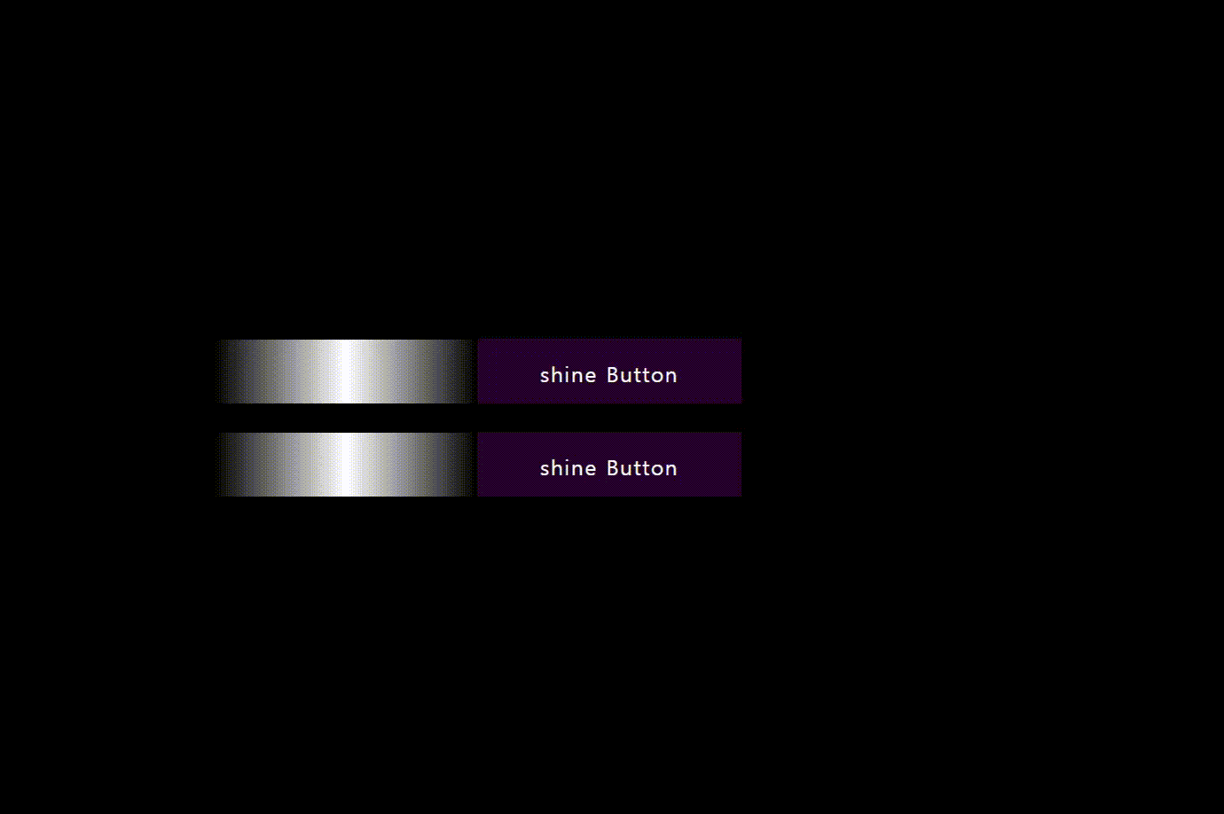
반짝 거리는 효과는 언뜻 보기에 복잡해 보이지만 가상선택자로 가상의 요소를 만들면 쉽게 구현 할수 있다.
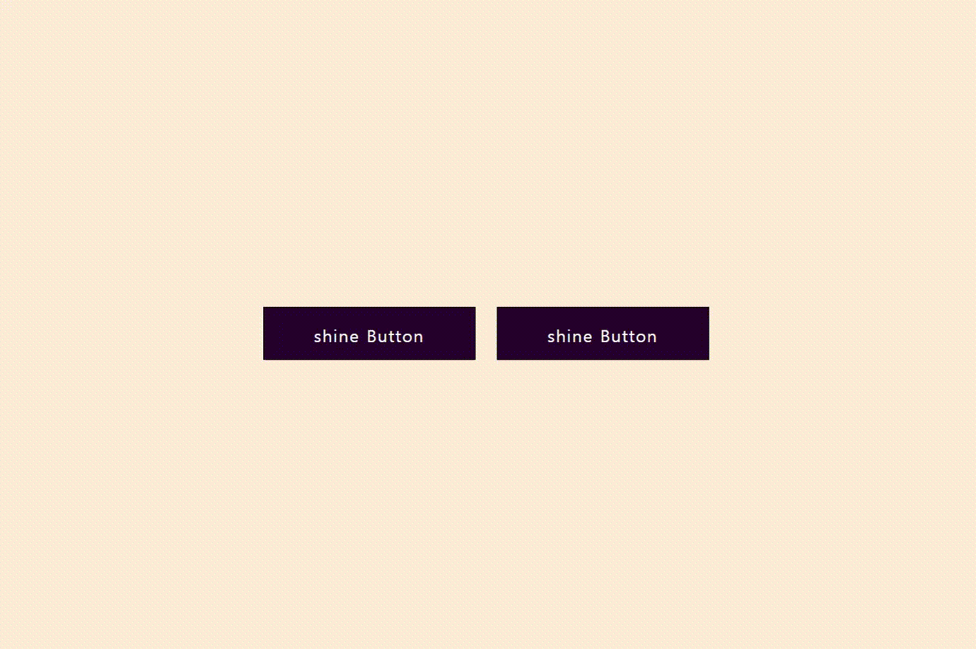
1. 버튼을 만든다
2. before 가상 선택자를 사용해 흰색의 그라데이션 가상요소를 생성한다.
3. 가상요소의 위치를 왼쪽 -> 오른쪽으로 이동시킨다.
[HTML]
<a href="#">shine Button</a>
<a href="#">shine Button</a>
[css]
* {
  box-sizing: border-box;
  margin: 0;
  padding: 0;
}

body {
  display: flex;
  justify-content: center;
  align-items: center;
  min-height: 100vh;
  background-color: #000;
}

a {
  position: relative;
  padding: 15px 30px;
  margin: 10px;
  width: 200px;
  height: 50px;
  background: #27022d;
  border: 1px solid #000;
  color: #fff;
  text-align: center;
  text-decoration: none;
  letter-spacing: 1px;
  transition: 0.5s;
  /* before로 생성된 가상요소를 가려준다. */
  overflow: hidden;
}

a:hover {
  background: #a41ee9;
}

a:nth-child(2):hover {
  background: #ff3c7f;
}

/* 그라데이션으로 생성된 가상요소 */
/* 이 요소가 기존 버튼 왼쪽-> 오른쪽 으로 이동하는 과정이 빛난는 효과처럼 보이게 한다. */
a::before {
  content: "";
  position: absolute;
  top: 0;
  left: -100%;
  width: 100%;
  height: 100%;
  background: linear-gradient(90deg, transparent, #fff, transparent);
  transition: 0.5s;
}

a:hover::before {
  left: 100%;
}