WEB animation & effect/product card
반응형 CSS Card Design
SeaPlus
2021. 10. 5. 20:48
[구현]
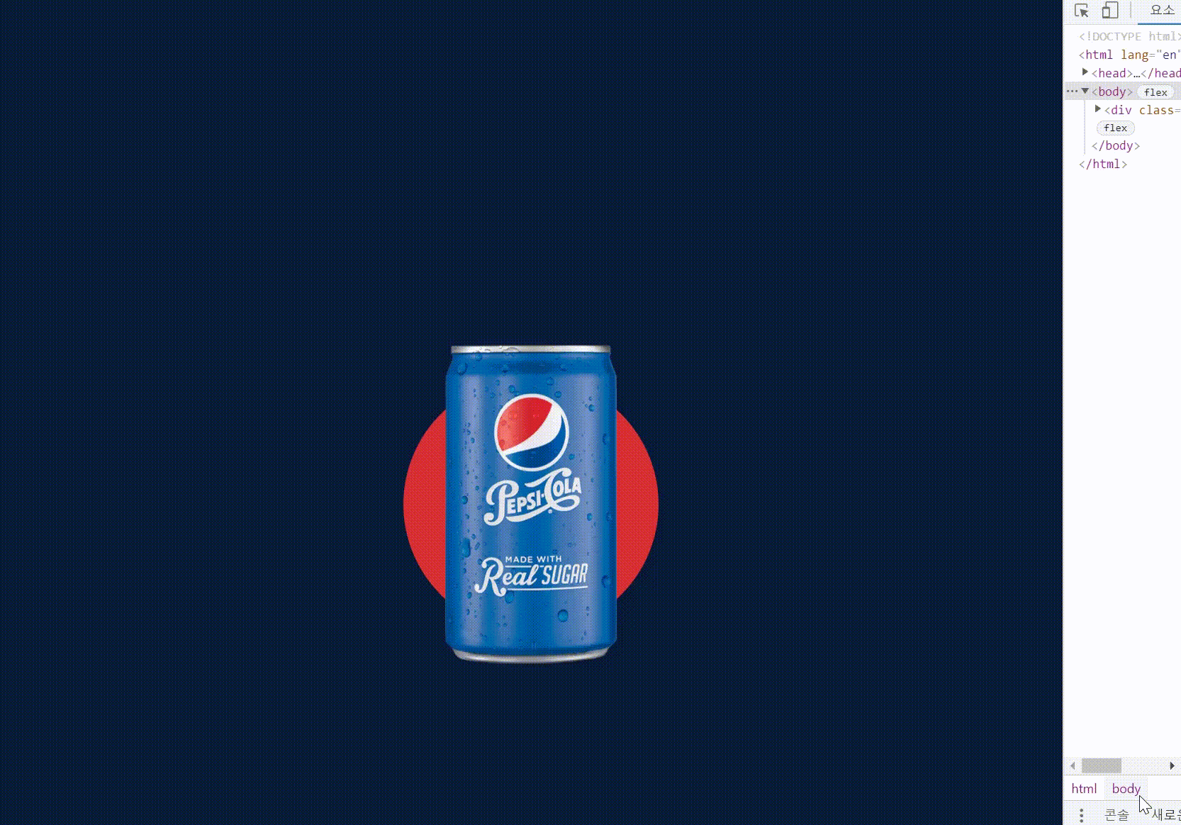
1. 배경의 원형 모양은 "가상선택자" 를 이용해 구현
circle 요소를 만든뒤 "circle::before" 일때 원형 모양 "circle:hover:before" 일때 card 모양 으로 구현
/* 원형 effect를 적용하기 위한 요소 */
.card .circle {
  position: absolute;
  top: 0;
  left: 0;
  width: 100%;
  height: 100%;
  border-radius: 20px;
  overflow: hidden;
}

.card .circle::before {
  content: "";
  position: absolute;
  top: 0;
  left: 0;
  width: 100%;
  height: 100%;
  background: #d83133;
  /* 원형모양 */
  clip-path: circle(120px at center);
  transition: 0.5s;
}
.card:hover .circle:before {
  background: #0065c3;
  /* 원래 card 크기 */
  clip-path: circle(400px at center);
}
세부적인 모양은 "clippy" 사이트에서 조정 가능하다.
https://bennettfeely.com/clippy/
Clippy — CSS clip-path maker
About Clip Paths The clip-path property allows you to make complex shapes in CSS by clipping an element to a basic shape (circle, ellipse, polygon, or inset), or to an SVG source. CSS Animations and transitions are possible with two or more clip-path shape
bennettfeely.com
text로 되어있는 content와 button은 "opacitiy , visibility" 를 기본과 hover일때를 다르게 적용하면 간단하다.
2. media 속성을 이용해 반응형으로 구현
[CSS: pointer-events 속성]
pointer-event 속성은 HTML 요소들의 터치/마우스 이벤트를 제어하는 속성이다.
총 11가지 속성값이 있지만 3가지 속성값을 제외한 나머지는 svg에서 사용할 수 있다.
| none | HTML 요소에 정의된 클릭, 상태(hover,active등), 커서 옵션들이 비활성화한다. |
| auto | 비활성화된 이벤트를 다시 기본 기능을 하도록 되돌린다. |
| inherit | 부모 요소로부터 pointer-events 값을 상속받는다. |
참고: CSS Responsive Card Hover Effects | Pepsi Card UI Design - YouTube