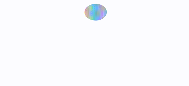
- 원 요소의 위치를 top:0 ->top:300으로 변화
- animation-direction을 alternate로 진행->역진행
- keframes 완료지점에서 width는 더 넓게 height는 더 적게 해서 튕기는 듯한 효과
* {
  box-sizing: border-box;
  margin: 0;
}

body {
  display: flex;
  justify-content: center;
  align-items: center;
  width: 100%;
  height: 100vh;
}

.circle {
  position: relative;
  width: 100px;
  height: 100px;
  border-radius: 50%;
  background-image: linear-gradient(
    to right,
    #eea2a2 0%,
    #bbc1bf 19%,
    #57c6e1 42%,
    #b49fda 79%,
    #7ac5d8 100%
  );
  animation-name: dropcircle;
  animation-duration: 1s;
  animation-direction: alternate;
  animation-iteration-count: infinite;
  animation-timing-function: ease-in;
}

@keyframes dropcircle {
  0% {
    top: 0;
  }
  75% {
    width: 100px;
  }
  to {
    top: 300px;
    width: 120px;
    height: 90px;
  }
}'WEB animation & effect' 카테고리의 다른 글
| Water wave animation (0) | 2021.09.12 |
|---|---|
| glowing icon & text (0) | 2021.09.11 |
| Loading spinner (0) | 2021.09.11 |
| Aurora UI (0) | 2021.09.06 |
| Loading-bar animation (0) | 2021.09.06 |