WEB animation & effect 23

Bounce-ball animation

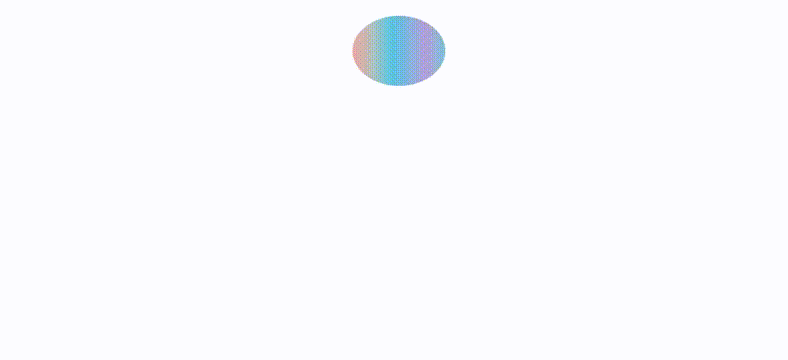
- 원 요소의 위치를 top:0 ->top:300으로 변화 - animation-direction을 alternate로 진행->역진행 - keframes 완료지점에서 width는 더 넓게 height는 더 적게 해서 튕기는 듯한 효과 * { box-sizing: border-box; margin: 0; } body { display: flex; justify-content: center; align-items: center; width: 100%; height: 100vh; } .circle { position: relative; width: 100px; height: 100px; border-radius: 50%; background-image: linear-gradient( to right, #eea..

Loading-bar animation

- 애니메이션 효과는 title과 gauge 두개의 요소에 적용시켰다. - gauge는 bar요소내부에 width:0으로 적용, keyframes에서 width:100% 늘어나는 구조가 기본 뼈대 - keyframes 중간값을 설정해 background-color가 계속 바뀌게 설정 * { box-sizing: border-box; margin: 0; padding: 0; } body { font-family: "Mulish", sans-serif; } .loading { display: flex; flex-direction: column; justify-content: center; align-items: center; height: 216px; width: 500px; } .loading-title ..

버튼 하단 슬라이더

- after 가상 요소를 이용해 동적인 효과 구현! - after 가상 요소의 넓이를 0 으로 지정한 뒤 커서가 올라갔을때(hover) 넓이를 100%로 늘린다. - transition 으로 변화 속도 조절 * { box-sizing: border-box; margin: 0px; padding: 0px; } body { display: flex; justify-content: center; align-items: center; font-family: "Lato", sans-serif; height: 100vh; width: 100%; } button, input, textarea { font-family: "Lato", sans-serif; } button { border: none; backgroun..